12. Dealing with a colour palette crisis 🎨 and an illustration competition
Putting my palette, and self out there
Hi, I’m Libby. I’m trying to find my feet in the world of illustration. I’ve done a load of research, and I’m sharing it here, along with my progress on how my illustration journey is going. I’m so glad you could join me on this bumpy ride!
TW: This post contains mention of miscarriage
Hello there!
Today, I’m writing from near Paddington train station in London. We’re currently cat-less and staying in a hotel between cat-sits with Bertie and Chaplin.
February has been a bit of a blur as I was ill for a good few weeks.
Despite not being 100%, I want to celebrate a mini milestone…
It’s newsletter number 12… which means I’ve been illustrating for 12 whole months!
It’s been a hell of a great year.
Here were some of my favourite months:
A colour palette crisis
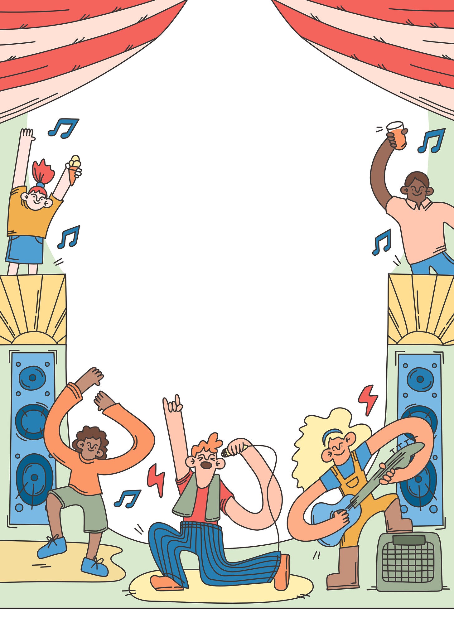
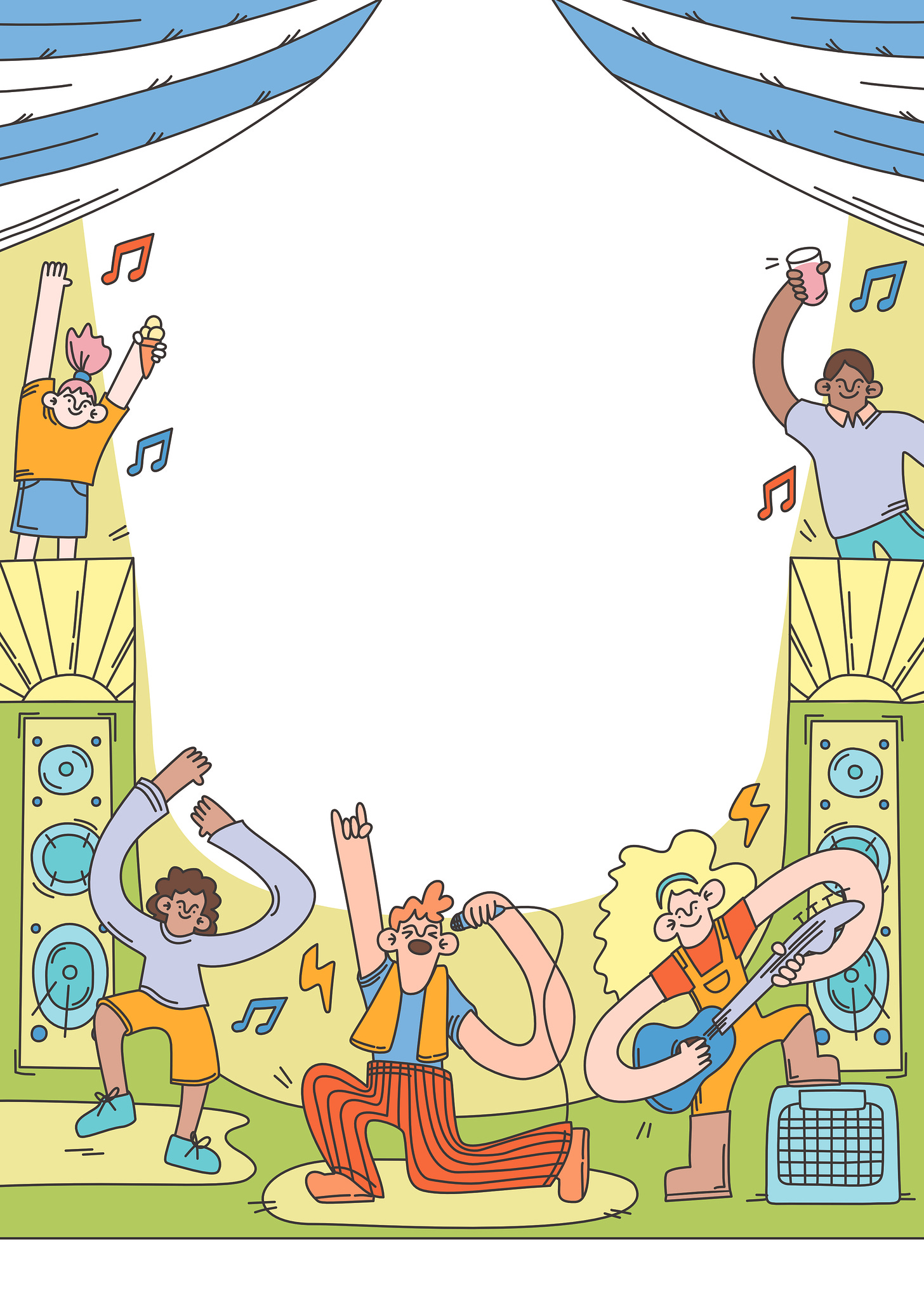
In February, I received a great commission to design artwork for a community music festival poster.
The commission was to be delivered in 3 formats: an A4 poster, a long banner and a Facebook post.
As I work in vector, I felt these 3 formats would be fairly easy to pull together.
I worked fast, producing initial sketches and revising them a few times through conversation with the client over a 48-hour period.
The challenge was when it came to colouring my artwork.
Until now, I’ve been working mostly in my own set colour palette, and I’ve not ventured far from the shades I’m comfortable with.
I’d been wanting to experiment more with colour but hadn’t dedicated time to do it yet.
For this piece of work, I needed to define a new palette that aligned with the event, and for some reason, I found this really tricky!
I think it was the pressure of getting it right, to make the poster shine and attract people to buy tickets.
The initial colours I played with made my artwork look young and the poster unbalanced.
I panicked, and due to illness, to be honest, I wanted to give up.
I took a break to gather my thoughts and set about researching palettes from scratch.
I started looking at images that had the feel I was looking for and began dissecting the colours to understand why they worked.
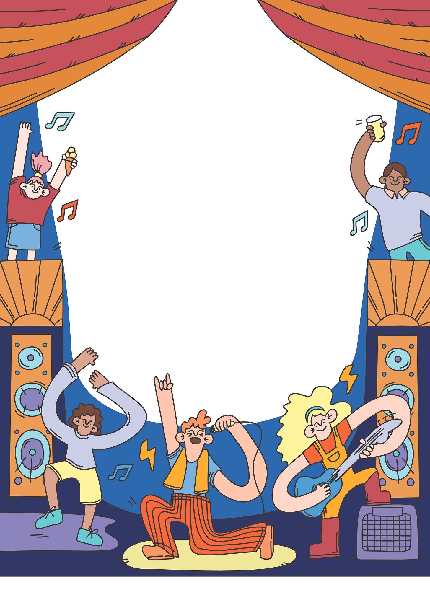
I looked at ‘festival’ images. This led me to choose 3 main shades of dark blue, deep red and orange.
I added a few additional shades and named my first palette ‘Warm nights’
I wanted to provide a range of 3 colour-ways as options for the client to choose from, so I set to work building a second palette, one that had a more daytime Summer feel.
I found an image I liked and started building a palette around it.
It had warmer, citrus shades so I called the palette ‘Fruity Summer.’ The blue and white tent was requested by the client.
Finally, I found another image I liked and extracted more muted, cooler, pastel shades similar to some other festival posters I’d come across. I named this third palette ‘Pastel Pop.’
All this image colour analysis got me thinking about the impact of my colour choices.
I’d previously been drawn to quite contrasting primary colours, and these, combined with my clean and cartoon-like style, can make my artwork err on the young side.
Instead, the colours that seem to work better and have a mature feel are those that are closer in tone.
I presented the options to the client, and they decided to use 2 of the palettes - Fruity Summer and Warm Nights.
I’m excited to see the finished poster and banner when the event details are finalised.
I’m also feeling much better about colour choice and feel like I have a method for experimenting with palettes for my next projects.
Entering an illustration competition
In February, I also decided to submit an entry to the World Illustration Awards.
It was something I wasn’t sure about as the awards asked for ‘technically excellent’ work, and I didn’t feel my work was elevated enough.
But I wanted to get used to putting myself out there.
So, I decided to submit the work that I was most proud of in the last year.
These were the illustrations I developed to demystify fertility treatment.
The illustrations might be simple, but they have a lot of meaning behind them.
So, I submitted these 3 images into the ‘Exploration’ category, which is the category where illustrators explore style and topics.


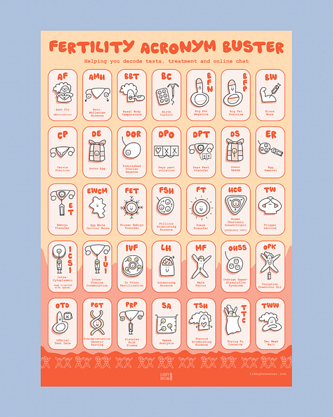
Here’s the blurb I added to my entry:
I began this project 2 weeks after an early miscarriage, my only pregnancy in a 5-year infertility journey. Fuelled by a feeling of isolation and frustration, I wanted to explore how accessible illustrations could be used to demystify the complex topic of fertility treatment and help encourage communication around it.
Information on how I used the illustrations:
I used my illustrations to create the concept of a fertility survival kit: a journal, poster and postcards. This project primarily helped me process my grief. An infertility journey can feel like recurring grief and conversations around it are difficult. I listened to others’ infertility stories throughout the project and after posting about the project on my illustration blog.
I wrote more about this project back in December.
I’m really happy to submit this work as an entry, and the process has given me the confidence to consider applying for others in future.
Did you enter the awards this year?
So that’s it for 1 whole year of illustration in the bag!
I might take a Spring break in monthly updates this month because it’s month number 13, and I’m a little superstitious like that 😝
I do, however, have the post I promised about illustration courses ready to go.
I just need to add a few images, so I will get it published next week.
Have a great month.
I hope the sun is beginning to poke through the clouds wherever you are… ☀️
Thanks for reading.
Libby





Love the illustrations and colours! Well done for getting to grips with the palettes - that's something I'm still trying to understand myself. I usually try for about 10 mins then give up and go look for palettes on Pinterest 😂